Showing posts with label Balance Artist. Show all posts

Sunday, April 19, 2009

Richard Serra


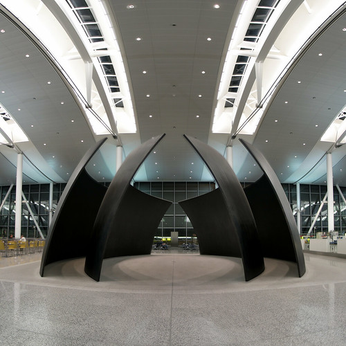
This work by Richard Serra called "Torqued Ellipse VI" is a great example of balance in art. There seems to be a horizontal symmetry line on the piece, yet when looking closely one can notice that it is not perfectly symmetrical. Yet the different values of the pice, the grayness of the floor, darkness of the piece itself and whiteness of the ceiling, create balance. Th fact that this whole piece is created in soft curves also creates balance as there are no hard lines that break its harmony. I feel like its balance also comes from its simplicity, it is a minimal design yet beautiful from its soft curves. I guess the softness of the design also contrasts and balances out the hardness of the steel used to make it.

Wednesday, April 15, 2009

Alexander Calder

Alexander Calder was the guy who invented the mobile. This comes as a shock to me, who grew up with a mobile above my head (birds of the West, including the glorious California Condor). I always assumed the mobile was a form that had existed since the dawn of time, while being extremely cool. Yet, I was always wrong: a fabulously inventive man invented it once.
The birds of the West mobile broke and lay discarded in my closet for years. Last summer, in an attempt to reclaim the kind virtues that I buried in middle school, I took out the mobile and found that it was twisted in a variety of knots and that the wires had snapped in a few places. After hours of tedious work, I fixed it.
I recommend fixing a mobile if you ever want to understand perfect balance.
I'm a rebellious dude, and I rebel particularly against perfect balance. In static sculpture or static painting, I find perfect balance perfectly boring. Yet a mobile is a way for me to tap into this design principle and really appreciate it.
I realize balance is not, in fact, object staying put. It is objects being pulled apart in perfect opposition to each other, like vectors whose sum is 0. Balance is the potential for an object to break apart in any number of ways, and in this it is even more dynamic than inbalance, which falls apart in only one way.
Here is a pretty mobile of Calder's, made rather late in life: 1960, when he was 62 years old.

Sunday, April 12, 2009

I always find myself transfixed by scenes of the beach and this picture seems to capture the perfect balance between the sand and the sea. As a result of this seemingly perfect balance, Richard Misrach manages to convey a harmony and sense of tranquility that one experiences when looking at the sea or being at the beach. The soft blue, glimmering in the sunlight seems soothing. Also, the person overlooking the ocean provides the viewer with an idea of the perspective and adds another dimension to the landscape, without losing the sense of balance. The texture of the sand is also juxtaposed with the smooth sea which forges together. I really enjoy looking at this picture because of the sense of balance and contrast between color and texture.

Monday, April 6, 2009

Pyramid River, Nevada, Richard Misrach


This photograph balances the water with the sky by attributing equally sized spaces to each. In addition the two rocks balance each other while framing the small rock in the center. I really like the simple composition of this photograph; it lends to the whole serene feeling of the picture.

Sunday, March 29, 2009

Tung Nguyen: Balance Artist (Bill Viola)


These are 2 still shots of "The Crossing" by Bill Viola. On the left, a figure was engulfed by flame. On the right, the same figure was disappearing into pouring water. The concept of balance is presented through opposite concepts that each alone is an extreme that can only be balanced by one of the other extreme. Left - right, fire - water, red - blue, warm - cool, hot - cold, bottom - top, and so on. The viewer can even sense the artist's desire for moderation, for compromise, and the message that the extremes are what harming us (burnt by fire or washed away by water) and we need a common ground to survive.

Bill Viola


Saturday, March 28, 2009

Balance Artist

I immediately was drawn to this piece by Elizabeth Murray because of the variety of color and use of shape reminded me of the urban art often seen in New York City. Murray plays with perspective by layering different images, with larger, bolder pieces in front and smaller, more subdues pieces in back. Despite the odd shapes and proportions of the individual images, there is a sense of balance towards the center of the piece. The bold blue fences on the top right and bottom left of the piece contribute to this balances, as well as the music notes on the left and right side

Tuesday, March 24, 2009

Richard Serra-Tilted Spheres


In this sculpture, Serra creates balance that is very symmetrical. Both sides of the sculpture share an equal weight, and I feel that this balance can evoke feelings of peace and tranquility. What I also find interesting is the consideration of open/negative space in creating such symmetrical balance. I feel that the interplay between open space and the space occupied by the sculpture is very aesthetically attractive. The open space, I feel, evokes a sense of freedom--an unrestricted ability to move through the space. However, there is also an element of imprisonment at the same time. The sculptured pieces are in a tilted position, and this could imply that the walls of the sculpture could fall in to each other, which trap you as you attempted to explore the sculpture. I think Serra achieves an interesting harmony by playing with the ideas of stability and instability.

Wednesday, March 18, 2009

Elizabeth Murray "The Lowdown"

This work by Elizabeth Murray plays with issues of balance. The vivid, contrasting colors and the jumble of organic and rectilinear shapes of various sizes create a sense of precarious balance. The lopsided rectangular shape of the overall composition also suggests that the pieces in this work may be on the brink of shifting or falling. At the same time, these bits of wood and painted canvas are not haphazard, but are unified by a certain sense of harmony. The linear pieces at the edges seem to hold the work together, and the repetition of colors and forms (such as the circles) brings the work into a kind of unexpected unity and balance. I like this work's playfulness and brightness.

Elizabeth Murray "Pigeon, 1991"


This piece was inspired by Salvador Dali melting clock.  The piece is of a woman and foot prints.  She is cut at the waist to show violence. 

Elizabeth Murray


Elizabeth Murray's 2001 piece 'Empire' is an excellent example of a varied use of perspective which distorts balance. She distorts the viewers perception by showing us both the tops and bottoms or the stacked mugs as well as a skewed view of the table top. Murray comments on her work, "You’re posing problems for yourself. It’s kind of like a battle of you against you, and you are trying to figure it out. And that’s when it gets painful." Thus Murray uses varied perspectives not only to peak interest in the viewer but more so to create a deeper level of involvement and analysis--creating a higher level of engagement with the work.

alex3.jpg

Alexander Calder's wire sculptures are some of my favorite art works. I like the way they make the viewer think about material and line in three dimensions. They almost appear to be three dimensional line drawings standing free  on their own in space rather than remaining trapped within the page. They look to balance precariously, but Calder was a master with mobiles and sculpture was well aware of how weight would need to be distributed. I'm sure that these works are very sturdy in reality. 

Bill Viola - "Heaven and Earth"


In "Heaven and Earth" by Bill Viola, two exposed cathode ray tubes, the lower screen showing his newborn son and the upper screen his recently deceased grandmother on her deathbed. Each of the images, perfectly positioned above each other with a small gap in between, are reflected in each other, evocative of a sense of balance in the cycle of life and death and the gap between the spiritual and the material. The delicate arrangement of the exposed CRTs evokes a sense of quiet, fragility, and balance, emphasized by their symmetrical arrangement on a floor-to-ceiling column. I think the use of negative space between the two curved screens is particularly effective, as the lines seem to flow into each other, briefly separate, and resume along the length of the column.

Balance


“One Ton Prop (House of Cards)” by Richard Serra takes balance into a new level. In this piece, there is relatively strict symmetry, along both the horizontal and vertical axis, from both looking at it from the top, and from any side. It’s also interesting to note that the shininess of the lead is balanced by some sort of white residue, visible in this image. However, there is the further balance of the fact that these giant plates are simply balanced against each other – nothing is welded or soldered together. The precariousness of this piece brings to mind a new sense of balance; perhaps that it’s a transient experience, and that the effects of balance combined with motion would be really interesting to explore.

Balance Artist: Richard Serra

This piece by Richard Serra is poignant in its use of balance. There are multiple lines of balance seen in the piece--one drawn between the two module (line of symmetry), one drawn vertically over the center of the profile, and one drawn horizontally. One of the modules appears unbalanced but both structures within this one feed into the other balanced. Additionally, the forces in the unbalance one seem to counteract each other and compensate for one another. Overall, the piece comments on the progression from stable to unstable and Serra uses balance to do so. 

Alexander Calder

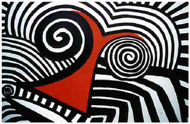
This image uses balance in an interesting way.  The solid red in the center draws your eye to the center, but it is balanced out in the rest of the painting by the intricate patterns that are in black and white.  The solid red also draws more weight towards the bottom of the painting because there is more of it there.  This is read as acceptable by viewers because we are used to the effects of gravity pulling everything down.  The swirls are balanced on both sides because although one is heavier because it has more black, the other has thinner lines, so it is more detailed and thus carries a counterbalancing weight.  At the bottom, the red is a little more to the left, but it is balanced out by the thick, angular lines on the right.  The draw attention because the rest of the piece is mostly swirling lines.

Richard Misrach


I was immediately taken in by this photo. The balance is not typical, since there is such a large area of the sand color and texture, but the slight bit of water in the corner manages to balance this area through its bright color that stands out against the sand, as well as the smooth texture which contrasts the rough sandy texture. The fact that the towel the couple is lying on is of a similar, bright color that the water is, the viewer's eye tends to connect the two, adding to the balance and giving a legato feel to the painting.

Richard Misrach- "Battleground Point #8"

This image by Richard Misrach almost looks like it has been cut in half horizontally and then diagonally to form 4 triangles which break up the picture. A line of separation zigzags across the frame, and the triangles that it forms alternate between the beige of the sand and the blue of the sky and its reflection in the water. This piece seems very balanced because of this simple pattern of shapes and colors, where all of the elements seem to draw the eye equally due to their similar size, form, and corresponding hues.

Richard Serra


Typically, when I think of "balance" I think of two elements, yet Richard Serra's piece successfully demonstrates a visually interesting relationship between three elements that creates a unified and balanced piece.
The vertical portions of each coil are longer than the horizontal ones, yet they are less tightly wound and as a result the visual weight of each portion is more balanced. The middle coil, the portion expected to be the focal point, is even less tightly wound than the coils on either side to further decrease this visual weight. The portions of the coil that are on the floor are again different lengths but because of the density of their coils, the viewer's eye is drawn to them as the focal point. Serra manipulates positive and negative space, visual weight, and object placement to create tbalance within his piece.