Showing posts with label Scale/Proportion Artist. Show all posts

Wednesday, April 15, 2009

Charles Ray

"Father Figure" is an eight-foot man in green. He is the blown-up, perfect replica of a child's toy. "The New Beetle" is a life-sized boy in white (concealed in this picture is the fact that he is playing with a fire truck toy). These sculptures are placed across from each other at Ray's 2008 exhibition at New York's Whitney Museum.
I get the feeling that there's some clever message here, but I'm hesitant to analyze this message outright. There are strong indications in Ray's history that his sculpture is more about immediate reactions than hidden messages.
There is an immediacy to each unit of the display: the tractor is powerful and huge, the boy is white and beautiful, and the fire truck is small and cute. When I first saw them, I was shocked by their strangeness. Then, quickly, I saw a logic to them. They are balanced in a natural way: one small, one medium, one big; one white, one red, one green (opposite colors); two toys, one boy. The objects go with each other.
In this innovative exhibition, Ray expands the imagination with the new element of size/proportion, but he ties his work together with the familiar element of balance.

Wednesday, March 11, 2009

Scale/Proportion Artist

This sculpture by Charles Ray uses a change in the scale to get across his message. It is clear from the person standing next to the sculpture for a visual size reference that this piece is significantly larger than the average person. Because of the business attire of the woman that is portrayed, we can infer a sense of power and not conforming to traditional gender roles. This is accentuated by her physical size. She towers over men, reversing the preconceived notions of the power that women posses compared to men.

Do-Ho Suh

This is Do-Ho Suh's installation, Fallen Star 1/5 Scale (2008) done for the exhibition "Psycho Buildings: Artist and Architecture" at the Hayward Gallery in London. The exhibition featured artists who construct dwelling like structures in exhibition spaces that invite the viewer to experience interior spaces emotionally and physically. Fallen Star features a scaled down model of the artist's apartment in Providence literally colliding with a smaller model of his childhood home in Korea.

Charles Ray


“Father Figure,” left, and “The New Beetle,” . He mess with the proportions of these to sculptures. they contrast each other in size. The Father figure was taken from the way a toy looked. But he blew it up in size so it is huge.

Do-ho Suh

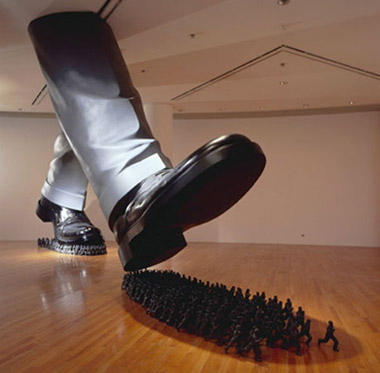
In this piece, Do-ho Suh's Karma, the artist used proportion and scale to relay his message to the viewer. This piece uses the human figure but in varied scale and proportion. By making one figue large in comparision to many smaller figures, there is a powerful and God-like association with the large figure, and a powerless and fearful sense attached to the many smaller figures.

Do-Ho Suh


This works shows an interesting take on scale and proportion. My first reaction was to wonder what the size of the room was. From the picture, one would think it to be an enormous space, which would emphasize the scale of the feet that much more. It would help to have someone viewing the piece in the picture to compare them to the size of the people running underneath the foot. Still even without this visual aid, the piece is an emphatic comment on power. Unknowing of the artist's intent, I immediately connect it to Hitler and the holocaust or other totalitarian regimes, and this connection is made purely on the basis of scale and proportion.

Do-Ho Suh

The message that I assume this piece is trying to convey (the power of a bigger force in the world, the weakness of 'the little guy', the easily replacable and interchangeable nature of the masses) is not only conceptual but visual- the giant size of the feet is greatly contrasted with the tiny bodies of the dozens of people underneath them. It seems like all the little people are running away, and the feet are just calmly walking over them. The use of proportion really makes the piece.

Maya Lin

In Maya Lin’s Systematic landscape, she uses simple shapes lined up horizontally one after another to create a landscape. She altered the scale of each piece so that some are lower than others and some are higher than others. This reflects the material learned in class because Maya Lin used different proportions to create a wave like movement. It is interesting to viewers’ eyes because the eye looks pass the sharp edges and in one’s head forms a sloping curvilinear form.

Wrapping


These are examples of Christo and Jeanne-Claude's wrapped trees. It is the scale of these works that makes them powerful, on a smaller scale they would not draw attention the same way. I love them precisely because they are so overwhelming, making you feel so small in comparison. What I find really interesting about this artist couple is that they apparently deny any greater meaning behind their works besides simply their aesthetic value.

Tuesday, March 10, 2009

Christo and Jeanne-Claude: The Umbrellas


In 1991, Christo and Jeanne-Claude opened their exhibition titled The Umbrellas, in which the artists place significant emphasis on the principles of scale and proportion. The $26 million project consisted of 1,340 blue umbrellas set up in Japan and 1,760 yellow umbrellas in southern California over acres of open land. In total three million people viewed the exhibition. This exhibition was particularly powerful because of its massive and impressive scale. Although, each umbrella measured 6 meters in height and 8.66 meters in diameter when viewed from a distance they appear to be nothing more than points on a hillside. It is interesting how drastically the proportion of the umbrellas changes when viewed up close and then from a distance. I think that this exhibition is an excellent conveyor of the principles of scale and proportion and is quite beautiful no matter the viewer’s perspective.

Jeanne Dunning, "Deep Hole"

"Deep Hole" by Jeanne Dunning is a multi-dimensional photograph that explores the art of scaled proportions. The focal point, the dark hole in the center, is created by spiraling or curving of what seems to be fingers or a hand making a fist. However, the blurred edges of the front and then the focusing of the skin as the "hole" gets deeper gives the feeling of movement and depth. It also looks as though someone is "looking" through the "hand". At the same time the proportion of the hand is distorted because of the blurred and clarity--to me the hand looks larger and longer.

Do-ho Suh


In this piece by Do-Ho Suh creates a very intriguing perspective as well as implies motion. I like extreme differences in proportion. 

"Karma"


This piece by Do-ho Suh, titled “Karma,” is interesting because of the proportion of the objects represented.  The dramatic juxtaposition of the scale of the feet and the scale of the people under the feet draws attention the comparison he is making.  I like this piece because it creates a sense of surrealism.  In addition, I like the way that the shapes of the feet correspond to the shapes of the groupings of people, making the composition more visually interesting and comparable. 

Tung Nguyen: Scale/Proportion Artist (Do-ho Suh)

This is Floor by Do-ho Suh. It depicts many small figures supporting a relatively giant person on a shiny pair of shoes. What I like about this is that it can be interpreted in two ways. It may be a giant is trying to crush the smaller people. It may be these tiny people trying to support the weight of giant to prevent themselves from being crushed. Either way, it shows the power one can have being the "giant" over others. Such situations are so abundant in real life (e.g. a manager vs his workers, a dictator vs his people, etc) that the viewer can relate to the piece immediately.

Alicia Dillard: Scale/proportion artist-maya lin


I really liked this piece by Maya Lin. When I look at this work, I feel as sense of calm and peace that is due to the circles and curvilinear lines. I also enjoyed the perspective that this photo took. By looking down on the piece it feels as if I am far away yet inside the work at the same time. The trees look so small, yet I automatically knew that they were trees. The pathway led by stones grounds the piece, for me. The stones focus my attention and lead me around the work so I am forced to see the piece the way the artist wanted me to look at it. If this photo were from any other perspective I do not think we would be able to see the whole picture. The closer we zoom into the piece the bigger the smaller circle becomes, until the larger circle cannot be seen anymore. This would chance my whole view of this work.

Paul Pfeiffer

This image, "Four Horsemen of the Apocalypse (17)" by Paul Pfeiffer, uses an odd perspective to shift the viewer's perception of the scale of the basketball player in the foreground and his relationship to the stadium and the crowd. The camera is set on the ground and is pointed upwards at the athlete, whose head is obscured by the glare of the lights on the far-away ceiling of the arena. This creates the illusion that the basketball player is a giant; people already have the perception of basketball players being unusually tall, but the perspective from the player's feet makes it seem like the viewer is like an ant in relation to the subject, and the fact that the lights obstruct the view of his head makes it seem like his head is actually at the ceiling, being touched by the lights. Then, the proximity to the player's feet and the placement of the camera on the floor make the crowd on the opposite side of the court seem miniscule, which adds to the illusion of the player being impossibly huge.

Charles Ray, Family Romance


Charles Ray's Family Romance depicts a family- a father, mother, son and baby daughter. However, every member of the family is the same height (135 cm). The effect is that the parents are dwarfed by their children who look like looming monsters. Even the faces of the children look quite grotesque. The children look like the ones in control of the family due to the distortion of their size and scale.

Charles Ray

This is an interesting sculpture of a woman.  If we had just seen her in the picture, then it would not have been clear that she was created at a much larger scale than life because all of her body parts are in proportion to one another.  The man in the picture provides a visual cue to viewers, signaling  that she is much larger than life.  In addition, the brightness of the pink she is wearing make her seem even larger than she actually is because the viewers eye is immediately drawn to all of the solid color.  I like how the artist uses different textures with the folding and pleating in the skirt to distinguish between the different pieces of her outfit.  Rather than using a lot of  color, Ray chose to create interest with the scale and the texture.

Krzystof Wodiczko

Krzysztof Wodiczko plays with scale and proportion in this piece by projecting a giant-scale image of a human head onto a screen.  The artist creates a captivating image by choosing a subject (a head) that the viewer is used to seeing on a smaller, more human-sized scale, and enlarging it to enormous proportions.  The woman's face in this piece appears several times bigger than the other objects surrounding it (stairs, architecture, etc.) and is no doubt much larger than the viewer.  This piece makes me feel unsettled and overwhelmed because there is something disturbing about seeing a human face (ordinarily much smaller) on such a large scale.

Tijuana Projection, 2001