 This image uses balance in an interesting way. The solid red in the center draws your eye to the center, but it is balanced out in the rest of the painting by the intricate patterns that are in black and white. The solid red also draws more weight towards the bottom of the painting because there is more of it there. This is read as acceptable by viewers because we are used to the effects of gravity pulling everything down. The swirls are balanced on both sides because although one is heavier because it has more black, the other has thinner lines, so it is more detailed and thus carries a counterbalancing weight. At the bottom, the red is a little more to the left, but it is balanced out by the thick, angular lines on the right. The draw attention because the rest of the piece is mostly swirling lines.
Wednesday, March 18, 2009
Alexander Calder
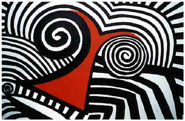
This image uses balance in an interesting way. The solid red in the center draws your eye to the center, but it is balanced out in the rest of the painting by the intricate patterns that are in black and white. The solid red also draws more weight towards the bottom of the painting because there is more of it there. This is read as acceptable by viewers because we are used to the effects of gravity pulling everything down. The swirls are balanced on both sides because although one is heavier because it has more black, the other has thinner lines, so it is more detailed and thus carries a counterbalancing weight. At the bottom, the red is a little more to the left, but it is balanced out by the thick, angular lines on the right. The draw attention because the rest of the piece is mostly swirling lines.
Subscribe to:
Post Comments (Atom)
No comments:
Post a Comment